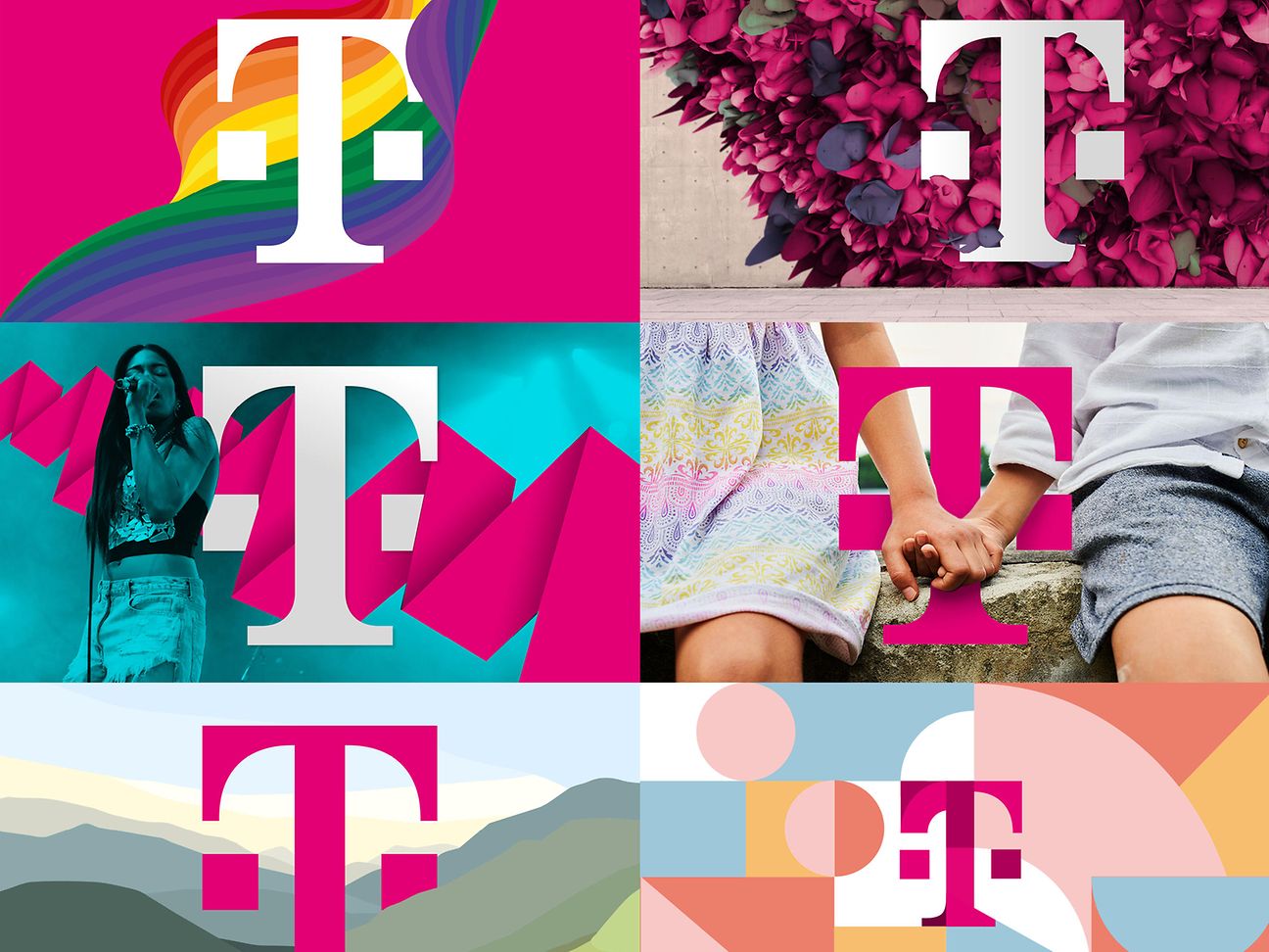

“T stands for Magenta, and Magenta stands for T”
T-Mobile Austria and UPC Austria have merged to form a full-service provider. Magenta Telekom is being launched with a new brand appearance. In an interview, Deutsche Telekom Chief Brand Officer Hans-Christian Schwingen puts this into perspective.
Mr. Schwingen, what brand change has just taken place in Austria?
T-Mobile Austria and UPC Austria have merged to form the new company Magenta Telekom, and that company will be marketing its products and services under the Magenta retail brand. The corporate brand will continue to be the internationally renowned T logo.
What was the reason for this move?
We wanted our Austrian subsidiary to be able to offer a full range of services from one source, in keeping with our Group's strategic orientation. In addition to mobile services, the company will also provide fixed-network, Internet, TV and convergence products. T-Mobile doesn't fit with such a comprehensive services range. And since our competitor in Austria, A1 has traditionally had a lock on the name Telekom Austria, we chose the most obvious alternative, which was Magenta Telekom.
The new name highlights Magenta. What was the thinking behind that?
We wanted to build on our momentum in Austria, and to send a strong signal about our new start to our customers and to the employees of both companies.
We wouldn't have been able to achieve that with just our established T brand, primarily because people in Austria tend to associate that brand with just the name T-Mobile. So we decided to feature Magenta in Austria even more strongly than we feature it in other markets – and to feature it as a true retail brand.
Is this an innovation in terms of brand strategy?
Yes. At the same time, it's also a logical next step. Magenta has been our brand color ever since Deutsche Telekom was founded. Internationally, Magenta has become synonymous with our company, to the point where our company and Magenta are seen as inseparably intertwined. And more people are aware of this connection today than ever before. In most of our markets, Magenta already stands for convergence products, and this helps us in orienting the company to young target groups.
The new combination logo stands for something more than just using Magenta to advertise products and services, which the company has been doing for some time now. How did you develop the new logo?
In our new retail brand, we combine the word Magenta with a T printed as a superscript. We're all familiar with the superscript "C" that means "copyright" and the superscript "TM" that stands for "trademark." Our new retail brand provides a similar type of key information. It indicates that the Magenta products and services being offered come from the T brand. In other words, it functions as a seal of certified origin and quality.
So the T is still the originating brand?
Yes. In introducing Magenta as a retail brand, we want to enhance the T's communicative power as a true experience brand. We still want to link the T with our brand color – which is exclusively ours throughout our industry – as broadly and as closely as possible. I could also put it this way: Magenta is a means to our goal of strengthening the T brand. The T stands for Magenta, and Magenta stands for the T.
Are you planning to rename any other national companies as Magenta Telekom?
Not at present. We have a special situation in Austria. And we want to tell a story there that is completely new for that country. For our customers and employees, and for the new company itself, we want the new name and the new retail brand to signal the start of a new era. And for that, we need a strong signal in our market.


